WaterBear: Building A Free Platform For Impactful Documentaries (Part 2)
Adrian Bece 2023-10-02T18:00:00+00:00
2024-06-12T20:05:40+00:00
In my previous article, I talked about Waterbear, a significant project I worked on as a newly-appointed lead developer, and the lessons I learned leading a team for the first time. In this second article, I’ll go over some key technical highlights from the project. Before we start, let’s quickly remind ourselves what WaterBear is all about and what makes it so interesting.
WaterBear is a free platform bringing together inspiration and action with award-winning high-production environmental documentaries covering various topics, from animals and climate change to people and communities. The WaterBear team produces their own original films and documentaries and hosts curated films and content from various high-profile partners, including award-winning filmmakers, large brands, and significant non-governmental organizations (NGOs), like Greenpeace, WWF, The Jane Goodall Institute, Ellen MacArthur Foundation, Nikon, and many others.
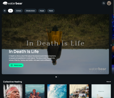
For context, I am currently working at a software development company called Q Agency based in Zagreb, Croatia. We collaborated with WaterBear and its partner companies to build a revamped and redesigned version of WaterBear’s web and mobile app from the ground up using modern front-end technologies.
In the first article, I briefly discussed the technical stack that includes a React-based front-end framework, Next.js for the web app, Sanity CMS, Firebase Auth, and Firestore database. Definitely read up on the strategy and reasoning behind this stack in the first article if you missed it.
Now, let’s dive into the technical features and best practices that my team adopted in the process of building the WaterBear web app. I plan on sharing specifically what I learned from performance and accessibility practices as a first-time lead developer of a team, as well as what I wish I had known before we started.
Image Optimization
Images are pieces of content in many contexts, and they are a very important and prominent part of the WaterBear app’s experience, from video posters and category banners to partner logos and campaign image assets.
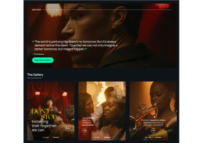
I think that if you are reading this article, you likely know the tightrope walk between striking, immersive imagery and performant user experiences we do as front-enders. Some of you may have even grimaced at the heavy use of images in that last screenshot. My team measured the impact, noting that on the first load, this video category page serves up as many as 14 images. Digging a little deeper, we saw those images account for approximately 85% of the total page size.
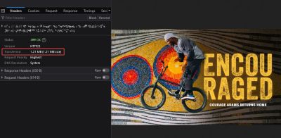
That’s not insignificant and demands attention. WaterBear’s product is visual in nature, so it’s understandable that images are going to play a large role in its web app experience. Even so, 85% of the experience feels heavy-handed.
So, my team knew early on that we would be leveraging as many image optimization techniques as we could that would help improve how quickly the page loads. If you want to know everything there is to optimize images, I wholeheartedly recommend Addy Osami’s Image Optimization for a treasure trove of insightful advice, tips, and best practices that helped us improve WaterBear’s performance.
Here is how we tackled the challenge.
Using CDN For Caching And WebP For Lighter File Sizes
As I mentioned a little earlier, our stack includes Sanity’s CMS. It offers a robust content delivery network (CDN) out of the box, which serves two purposes: (1) optimizing image assets and (2) caching them. Members of the WaterBear team are able to upload unoptimized high-quality image assets to Sanity, which ports them to the CDN, and from there, we instruct the CDN to run appropriate optimizations on those images — things like compressing the files to their smallest size without impacting the visual experience, then caching them so that a user doesn’t have to download the image all over again on subsequent views.
Requesting the optimized version of the images in Sanity boils down to adding query variables to image links like this:
https://cdn.sanity.io/.../image.jpg?w=1280&q=70&auto=format
Let’s break down the query variables:
wsets the width of the image. In the example above, we have set the width to1280pxin the query.qsets the compression quality of the image. We landed on 70% to balance the need for visual quality with the need for optimized file sizes.formatsets the image format, which is set toauto, allowing Sanity to determine the best type of image format to use based on the user’s browser capabilities.
Notice how all of that comes from a URL that is mapped to the CDN to fetch a JPG file. It’s pretty magical how a completely unoptimized image file can be transformed into a fully optimized version that serves as a completely different file with the use of a few parameters.
In many cases, the format will be returned as a WebP file. We made sure to use WebP because it yields significant savings in terms of file size. Remember that unoptimized 1.2 MB image from earlier? It’s a mere 146 KB after the optimizations.

And all 14 image requests are smaller than that one unoptimized image!

The fact that images still account for 85% of the page weight is a testament to just how heavy of a page we are talking about.
Another thing we have to consider when talking about modern image formats is browser support. Although WebP is widely supported and has been a staple for some time now, my team decided to provide an optimized fallback JPG just in case. And again, Sanity automatically detects the user’s browser capabilities. This way, we serve the WebP version only if Sanity knows the browser supports it and only provide the optimized fallback file if WebP support isn’t there. It’s great that we don’t have to make that decision ourselves!
Have you heard of AVIF? It’s another modern image format that promises potential savings even greater than WebP. If I’m being honest, I would have preferred to use it in this project, but Sanity unfortunately does not support it, at least at the time of this article. There’s a long-running ticket to add support, and I’m holding hope we get it.
Would we have gone a different route had we known about the lack of AVIF support earlier? Cloudinary supports it, for example. I don’t think so. Sanity’s tightly coupled CDN integration is too great of a developer benefit, and as I said, I’m hopeful Sanity will give us that support in the future. But that is certainly the sort of consideration I wish I would have had early on, and now I have that in my back pocket for future projects.
Tackling The Largest Contentful Paint (LCP)
LCP is the biggest element on the page that a user sees on the initial load. You want to optimize it because it’s the first impression a user has with the page. It ought to load as soon as possible while everything under it can wait a moment.
For us, images are most definitely part of the LCP. By giving more consideration to the banner images we load at the top of the page, we can serve that component a little faster for a better experience. There are a couple of modern image attributes that can help here: loading and fetchpriority.
We used an eager loading strategy paired with a high fetchpriority on the images. This provides the browser with a couple of hints that this image is super important and that we want it early in the loading process.
<!-- Above-the-fold Large Contentful Paint image -->
<img
loading="eager"
fetchpriority="high"
alt="..."
src="..."
width="1280"
height="720"
class="..."
/>
We also made use of preloading in the document <head>, indicating to the browser that we want to preload images during page load, again, with high priority, using Next.js image preload options.
<head>
  <link
    rel="preload"
    as="image"
    href="..."
    fetchpriority="high"
  />
</head>
Images that are “below the fold” can be de-prioritized and downloaded only when the user actually needs it. Lazy loading is a common technique that instructs the browser to load particular images once they enter the viewport. It’s only fairly recently that it’s become a feature baked directly into HTML with the loading attribute:
<!-- Below-the-fold, low-priority image -->
<img
  decoding="async"
  loading="lazy"
  src="..."
  alt="..."
  width="250"
  height="350"
/>
This cocktail of strategies made a noticeable difference in how quickly the page loads. On those image-heavy video category pages alone, it helped us reduce the image download size and number of image requests by almost 80% on the first load! Even though the page will grow in size as the user scrolls, that weight is only added if it passes through the browser viewport.

In Progress: Implementing srcset
My team is incredibly happy with how much performance savings we’ve made so far. But there’s no need to stop there! Every millisecond counts when it comes to page load, and we are still planning additional work to optimize images even further.
The task we’re currently planning will implement the srcset attribute on images. This is not a “new” technique by any means, but it is certainly a component of modern performance practices. It’s also a key component in responsive design, as it instructs browsers to use certain versions of an image at different viewport widths.
We’ve held off on this work only because, for us, the other strategies represented the lowest-hanging fruit with the most impact. Looking at an image element that uses srcset in the HTML shows it’s not the easiest thing to read. Using it requires a certain level of art direction because the dimensions of an image at one screen size may be completely different than those at another screen size. In other words, there are additional considerations that come with this strategy.
Here’s how we’re planning to approach it. We want to avoid loading high-resolution images on small screens like phones and tablets. With the srcset attribute, we can specify separate image sources depending on the device’s screen width. With the sizes attribute, we can instruct the browser which image to load depending on the media query.
In the end, our image markup should look something like this:
<img
  width="1280"
  height="720"
  srcset="
    https://cdn.sanity.io/.../image.jpg?w=568&...   568w,
    https://cdn.sanity.io/.../image.jpg?w=768&...   768w,
    https://cdn.sanity.io/.../image.jpg?w=1280&... 1280w
  "
  sizes="(min-width: 1024px) 1280px, 100vw"
  src="https://cdn.sanity.io/.../image.jpg?w=1280&..."
/>
In this example, we specify a set of three images:
- Small:
568px, - Medium:
768px, - Large:
1280px.
Inside the sizes attribute, we’re telling the browser to use the largest version of the image if the screen width is above 1024px wide. Otherwise, it should default to selecting an appropriate image out of the three available versions based on the full device viewport width (100vw) — and will do so without downloading the other versions. Providing different image files to the right devices ought to help enhance our performance a bit more than it already is.
Improving CMS Performance With TanStack Query
The majority of content on WaterBear comes from Sanity, the CMS behind the web app. This includes video categories, video archives, video pages, the partners’ page, and campaign landing pages, among others. Users will constantly navigate between these pages, frequently returning to the same category or landing page.
This provided my team with an opportunity to introduce query caching and avoid repeating the same request to the CMS and, as a result, optimize our page performance even more. We used TanStack Query (formerly known as react-query) for both fetching data and query caching.
const { isLoading, error, data } = useQuery( /* Options */ )
TanStack Query caches each request according to the query key we assign to it. The query key in TanStack Query is an array, where the first element is a query name and the second element is an object containing all values the query depends on, e.g., pagination, filters, query variables, and so on.
Let’s say we are fetching a list of videos depending on the video category page URL slug. We can filter those results by video duration. The query key might look something like this basic example:
const { isLoading, error, data } = useQuery(
  {
    queryKey: [
      'video-category-list',
      { slug: categorySlug, filterBy: activeFilter }
    ],
  queryFn: () => /* ... */
  }
)
These query keys might look confusing at first, but they’re similar to the dependency arrays for React’s useEffect hook. Instead of running a function when something in the dependency array changes, it runs a query with new parameters and returns a new state. TanStack Query comes with its dedicated DevTools package. It displays all sorts of useful information about the query that helps debug and optimize them without hassle.
Let’s see the query caching in action. In the following video, notice how data loads instantly on repeated page views and repeated filter changes. Compare that to the first load, where there is a slight delay and a loading state before data is shown.
Now, we’ve optimized performance on the fetching side of things, the markup side of things, and the query side of things. That’s a nice spread of coverage the team can be proud of.
Accessibility Efforts
Accessibility is hard! That’s not to knock it, but to recognize the importance of all the work that it entails. The realm of accessibility is much bigger than making sure alt text is used on images and screen readers announcing things in order. It’s a practice unto itself and is directly influenced by the front-end work we do. Even unintentionally, our code can, at best, adversely impact a user’s ability to access certain content and, at worst, make it completely impossible to navigate a site with assistive technology.
This being my first significant project as a lead developer, I wanted the quality of the code my team writes (based on The Four Pillars outlined in the first article of this series) to consider accessibility with special attention to not ruining something that already worked.
That extends to the decisions we make when implementing new features, particularly those that leverage third-party resources.
Whether a resource provides solid a11y features right out of the box was a key determining factor in what solutions we chose for the WaterBear app.
“
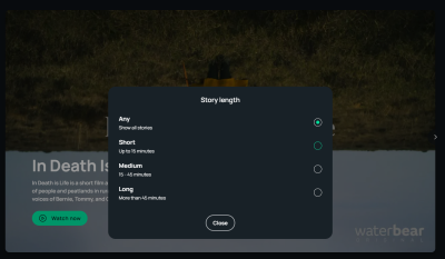
For example, it’s probably obvious that an app for documentaries is going to be designed around video. We made sure to choose a video player with a decent level of a11y support that allows users full keyboard control, uses clear focus states, adds basic aria-* attributes where necessary, includes focus-trapping within modal components, writes semantically-correct HTML… you get the idea. There’s a lot to consider.
We’re probably not even covering all of our bases! It’s so tough to tell without ample user testing. It’s a conflicting situation where you want to do everything you can while realistically completing the project with the resources you have and proceed with intention.
We made sure to include a label on interactive elements like buttons, especially ones where the icon is the only content. For that case, we added visually hidden text while allowing it to be read by assistive devices. We also made sure to hide the SVG icon from the assistive devices as SVG doesn’t add any additional context for assistive devices.
<!-- Icon button markup with descriptive text for assistive devices -->
<button type="button" class="...">
  <svg aria-hidden="true" xmlns="..." width="22" height="22" fill="none">...</svg
  ><span class="visually-hidden">Open filters</span>
</button>
.visually-hidden {
  position: absolute;
  width: 1px;
  height: 1px;
  overflow: hidden;
  white-space: nowrap;
  clip: rect(0 0 0 0);
  -webkit-clip-path: inset(50%);
  clip-path: inset(50%);
}
Supporting keyboard navigation was one of our accessibility priorities, and we had no trouble with it. We made sure to use proper HTML markup and avoid potential pitfalls like adding a click event to meaningless div elements, which is unfortunately so easy to do in React.
We did, however, hit an obstacle with modals as users were able to move focus outside the modal component and continue interacting with the main page while the modal was in its open state, which isn’t possible with the default pointer and touch interaction. For that, we implemented focus traps using the focus-trap-react library to keep the focus on modals while they’re opened, then restore focus back to an active element once the modal is closed.
Dynamic Sitemaps
Sitemaps tell search engines which pages to crawl. This is faster than just letting the crawler discover internal links on its own while crawling the pages.
The importance of sitemaps in the case of WaterBear is that the team regularly publishes new content — content we want to be indexed for crawlers as soon as possible by adding those new links to the top of the sitemap. We don’t want to rebuild and redeploy the project every time new content has been added to Sanity, so dynamic server-side sitemaps were our logical choice.
We used the next-sitemap plugin for Next.js, which has allowed us to easily configure the sitemap generation process for both static and dynamic pages. We used the plugin alongside custom Sanity queries that fetch the latest content from the CMS and quickly generate a fresh sitemap for each request. That way, we made sure that the latest videos get indexed as soon as possible.
Let’s say the WaterBear team publishes a page for a video named My Name is Salt. That gets added to a freshly generated XML sitemap:
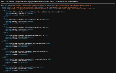
Now, it’s indexed for search engines to scoop up and use in search results:

lastmod value in the sitemap. (Large preview)
Until Next Time…
In this article, I shared some insights about WaterBear’s tech stack and some performance optimization techniques we applied while building it.
Images are used very prominently on many page types on WaterBear, so we used CDN with caching, loading strategies, preloading, and the WebP format to optimize image loading performance. We relied on Sanity for the majority of content management, and we expected repeating page views and queries on a single session, prompting us to implement query caching with TanStack Query.
We made sure to improve basic accessibility on the fly by styling focus states, enabling full keyboard navigation, assigning labels to icon buttons, providing alt text for images, and using focus traps on modal elements.
Finally, we covered how my team handled dynamic server-side rendered sitemaps using the next-sitemap plugin for Next.js.
Again, this was my first big project as lead developer of a team. There’s so much that comes with the territory. Not only are there internal processes and communication hurdles to establish a collaborative team environment, but there’s the technical side of things, too, that requires balancing priorities and making tough decisions. I hope my learning journey gives you something valuable to consider in your own work. I know that my team isn’t the only one with these sorts of challenges, and sharing the lessons I learned from this particular experience probably resonates with some of you reading this.
Please be sure to check out the full work we did on WaterBear. It’s available on the web, Android, and iOS. And, if you end up watching a documentary while you’re at it, let me know if it inspired you to take action on a cause!
References
- Fast load times (web.dev)
- “Hide Content,” Dave Rupert (The A11Y Project)
- “Use WebP images,” Katie Hempenius (web.dev)
- “Accessible SVGs: Perfect Patterns For Screen Reader Users,” Carie Fisher
- TanStack Query Documentation
Many thanks to WaterBear and Q Agency for helping out with this two-part article series and making it possible. I really would not have done this without their support. I would also like to commend everyone who worked on the project for their outstanding work! You have taught me so much so far, and I am grateful for it.
(gg, yk, il)
